小程序自定义组件
时间:2020-09-17 22:00:46
收藏:0
阅读:66
1.根目录的components是用来自定义组件的文件夹,新建文件夹之后新建component才可以成功创建可以使用的组件
注意点:
  1.自定义组件的json文件中必须声明"component": true 按步骤创建,小程序会自动生成

  2.自定义组件的js文件中使用的函数不再是Page而是Component,所有的组件方法必须使用methods包裹
2.组件传值
父传子(只是一个简单的demo,实现父组件传递值给自定义组件)
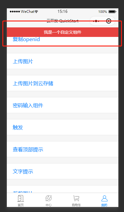
实现效果
自定义组件部分
wxml
<view class="flex_Center backgroundViewStyle">
  <view class="flex_Center demoButtonStyle" bindtap="onClickButton">查看顶部提示</view>
</view>

<view class="toptips {{ isTopTips ? ‘toptips--show‘ : ‘‘ }}">{{ message }}</view>
js
let timer = null;

Component({
  properties: {
    message: {              // message为定义的值
      type: String,        // 传递的值类型
      value:"默认值"       // 自定义组件默认值
    }
  },
  data: {
    isTopTips: false,
  },
  methods:{
    // 页面加载
    onUnload: function () {
      clearTimeout(timer);
    },
    // 点击按钮
    onClickButton: function(){
      let that = this;
      that.setData({
        isTopTips: true
      });
      timer = setTimeout(function () {
        that.setData({
          isTopTips: false
        });
      }, 1500);
    }
  }
})
wxss
.backgroundViewStyle{
  background:white;flex-direction:column;
}
.toptips {
  display: block;
  position: fixed;
  -webkit-transform: translateZ(0) translateY(-100%);
  width: 100%;
  /* 至少有一行的高度,保证第一次动画显示正常 */
  min-height: 32px;
  top: 0;
  left:0;
  line-height: 2.3;
  font-size: 14px;
  text-align: center;
  color: #FFF;
  background-color: #E64340;
  z-index: 110;
  /* 动画部分 */
  transition: all 0.4s ease;
}
.toptips--show {
  -webkit-transform: translateZ(0) translateY(0);
}
父组件部分
// 第一步json文件中进行引入组件
{
  "usingComponents": {
    "topmsg":"/components/topmsg/topmsg"
  }
}
// 第二步,引入成功之后使用标签渲染
// json文件中topmsg是引入组件的名称,也可以自定义
<!-- 顶部提示 -->
  <view class="uploader">
    <view class="uploader-text">
      <topmsg message="我是一个自定义组件"/>
    </view>
  </view>
评论(0)