小程序自定义类似于选择器弹框
时间:2020-03-24 14:30:37
收藏:0
阅读:143
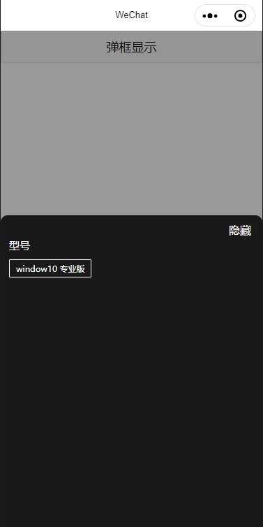
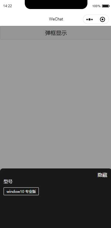
在开发小程序时,隐藏和显示是我们用的比较多的一种,但是就简简单单的显示隐藏,有的时候觉得太low,所以分享一个类似于城市选择器那种从下到上的那种弹框;
这中间就要用到小程序动画 Animation
已经是写好的小demo;可以直接拿过来使用;
.wxml
<button bindtap="showModel">弹框显示</button>
<!-- 弹框 -->
<!-- 渐深的背景层 -->
<view class=‘{{bg}}‘ catchtap="hidden" style="visibility:{{backgroundVisible ? ‘visible‘:‘hidden‘}};z-index:30"></view>
<!-- 底部弹出层 -->
<view class="element-wrapper" animation="{{animation}}" style="visibility:{{show ? ‘visible‘:‘hidden‘}}">
  <view class="specifibox" style="padding-bottom:{{isIphoneX ? 64:0}}rpx">
    <view class="top_imgs">
      <text catchtap="hidden" class="del">隐藏</text>
    </view>
    <view class="specifibox_bottom">
      <view class="box_li_parent">
        <view class="box_li" >
          <view class="classNav">
            <text class="specification">型号</text>
          </view>
          <view>
            <text>window10 专业版</text>
          </view>
        </view>
      </view>
    </view>
  </view>
</view>
.wxss 如果想要改变弹框的高度 需要在 specifibox属性名中更改属性
.background {
  background-color: rgba(0, 0, 0, 0);
  width: 100vw;
  height: 100vh;
  position: absolute;
  top: 0;
   z-index: 99;
}

.bg {
  background: rgba(0,0,0,0.4);
  width: 100vw;
  height: 100vh;
  position: absolute;
  top: 0;
  transition-property: background-color;
  transition-timing-function: ease;
  transition-duration: 1s;
  transition-delay: 0;
   z-index: 99;
}
.del{
  width:72rpx;
  height: 28rpx;
  position: absolute;
  right: 24rpx;
  top: 20rpx;
  color: #fff;
}
.element-wrapper {
  display: flex;
  position: fixed;
  left: 0;
  bottom: 0;
   width:750rpx;
height:920rpx;
  z-index: 888;
}
/* 规格弹框 */
.specifibox{
  width:750rpx;
height:920rpx;
background:#191919;
border-radius:20rpx 20rpx 0px 0px;
position: absolute;
  left: 0;
  bottom: 0;
  z-index: 11;
}
.top_imgs{
  display: flex;
  position: relative;
    margin-bottom: 15rpx;
    height: 50rpx;
    width: 100%;
}

.box_li_parent{
  height: 770rpx;
  overflow: auto;
}
.box_li{
  display: flex;
  flex-wrap: wrap;
  margin-bottom: 30rpx;
}
.box_li>view{
 border:1px solid rgba(255,255,255,1);
border-radius:4rpx;
padding: 9rpx 18rpx 8rpx 19rpx;
margin-left: 24rpx;
margin-top: 20rpx;
display: flex;
justify-content: center;
align-items: center;
}
.box_li>view>text{
  font-size:24rpx;
font-weight:400;
color:rgba(255,255,255,1);
}
.box_li>.classNav{
  width: 100%;
   display: block;
    margin-left: 24rpx;
    margin-top: 0;
    padding: 0;
    border-radius: 0;
    background: #191919;
    border: none;
}
.box_li>.classNav>.specification{
  font-size:30rpx;
font-weight:500;
color:rgba(255,255,255,1);
}
.boxs_1{
  height: 514rpx;
  width: 100%;
}
.js
var action = ‘‘;
var moveY = 200;
var animation = animation = wx.createAnimation({
  transformOrigin: "50% 50%",
  duration: 400,
  timingFunction: "ease",
  delay: 0
})
animation.translateY(moveY + ‘vh‘).step();
Page({

  /**
   * 页面的初始数据
   */
  data: {
    animation: animation,
    bg: ‘background‘,
    backgroundVisible: false,
    show:false,
    isIphoneX:false
  },
  //隐藏弹窗浮层
  hidden(e) {
    moveY = 200;
    action = ‘hide‘;
    animationEvents(this, moveY, action);
  },
  //规格按钮点击事件
  showModel: function (e) {
    moveY = 0;
    action = ‘show‘;
    animationEvents(this, moveY, action);
  },
})

//动画事件 底部的弹出,背景层通过切换不同的class,添加一个transition的效果,使之有一个渐变的感觉。
function animationEvents(that, moveY, action) {
  that.animation = wx.createAnimation({
    transformOrigin: "50% 50%",
    duration: 400,
    timingFunction: "ease",
    delay: 0
  })
  that.animation.translateY(moveY + ‘vh‘).step()
  if (action == ‘show‘) {
    that.setData({
      animation: that.animation.export(),
      show: true,
      backgroundVisible: true,
      bg: ‘bg‘,
      disableScroll: ‘disableScroll‘
    });
  } else if (action == ‘hide‘) {
    that.setData({
      animation: that.animation.export(),
      show: false,
      backgroundVisible: false,
      bg: ‘background‘,
      disableScroll: ‘‘
    });
  }
}
评论(0)